Tuesday, November 22, 2011

Announcement

Hi all,

We want to give a heartfelt thanks to our InCircle Interiors readers and let you know that we have loved launching this blog and website and connecting with you because of a shared passion in interior design. We are parting ways and wanted to let you know where you can find us! Cyndi is at wantwickless.com and will be intermittently checking in at InCircle Interiors. Martha will continue blogging at mhwinteriors.blogspot.com. Thanks for following us and please stay in touch!

Cyndi & Martha

Tuesday, November 15, 2011

Master Bedroom Redesign on a Budget - DIY Ombre Art

I've been loving the whole ombre trend, so when I saw this bright pink ombre canvas done by Danielle Oakey, I added it to my Pinterest DIY to-do list right away.  Isn't that thing gorgeous? Especially paired with that exquisite blue desk.

I did mine in yellow and practiced beforehand on a piece of paper. Pretty straightforward - start with straight yellow, then add more and more white as you get to the middle. It's not an exact science,  just an eyeball-it kind of thing. I used some acrylic paints I already had in my stash.


Since I knew I was getting rid of this black and white leaves canvas from Ikea, I decided to see if I could re-purpose it instead of handing it over to Goodwill. 
Turns out I could! I painted over it using leftover white Valspar from this dresser project. It took several coats, but now you can't see the black at all.
Then I just jumped in and started applying the yellow.
The pictures aren't great, so I didn't take too many, but you get the idea. Dark yellow turns into lighter yellow equals ombre. 


And here's the finished painting. Every time my daughter walks into my room and sees it she says, "Nice picture, mom!" I have to agree. I love how it turned out! It totally brightens our room and I can see it fitting in perfectly with everything else I've got in mind for the room.

Oh, and the best part is, the only thing I bought for this project was a 39 cent wide foam brush. Woot! 

*Martha

Monday, November 14, 2011

Master Bedroom Redesign on a Budget - Before Photos

I almost forgot! We can't do a proper room re-do without those hideous "before" shots. So here they are, the before photos of our bedroom.


I've been so stuck for so long with this bedroom and I've finally realized why: it's that bedspread. I've tried to find art I like that goes with it and I just couldn't get excited about orange and brown foliage with a smattering of birds. Ugh. 
So, we're going with some pale grey/white/cream for the majority of the bedding with splashes of color in the throw pillows and on the walls.


Speaking of color on the walls, next up is my post about a DIY ombre art piece I did for the wall. Stay tuned...


*Martha

Friday, November 11, 2011

Master Bedroom Redesign on a Budget - Cheap Lamps

As I mentioned, while shopping around for lamps, I was finding a sad trend: all the ones I loved were around $100 and even the ones I kind of loved were in the $50 range. My dream lamps are going for $150! Shoot, do I want to eat this week or buy a lamp? Yeah. So, to Value Village (a thrift store like Goodwill) I went. I was looking for a bubble or gourd style lamp base. Bottom line, I wanted some beefy lamps! None of those skinny weeny lamps we were used to. I was hoping to find two matching white ones (or even better, yellow!), but instead found these: 


The blue is for my hubby and the white is for me. I think it works out better that way anyway. He's a dude, I'm a girl, and our lamps can be some kind of manifestation of that. They were both labeled as $4.99 but I got to the counter and found that mine was only $2. Seven dollars for two lamp bases! Woot! Since these lamps could not be returned after purchased, the lady at the checkout stand handed me a light bulb and told me to go test them at their testing station in the back to make sure they worked. She said they usually test the electrical items they sell, but sometimes can't get to all of them if there is too much inventory coming in and they run out of time.  Who knew there was a testing station? It's just a strip of electrical outlets. Great company at the testing station! People who buy used electronics are gems!


I initially bought a lamp harp because I thought I needed one to hold a lamp shade.


I installed it on my lamp, which involved taking it apart and rewiring it. Totally intimidating and terrifying, but it turned out fine in the end.


I had bought these two lamp shades at Ross for $7 each. Definitely not my dream shades, but I thought I'd try them out.


 Once the harp was on, I had some gluing to do to get my lamp to stand upright.


However, I found these $14 each drum style lamp shades at Target and decided to take the Ross ones back because I like these much better. No harps needed for these shades. Here's a preliminary look at our lamps! 


Mine turned out to be $16 and Adam's cost $ 18. Not bad for $100 lamp wannabes!

*Martha

Thursday, November 10, 2011

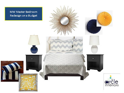
Master Bedroom Redesign on a Budget - Design Board

Here's the gist of what I want our master bedroom to come out looking like. This isn't EXACTLY what I'm going to do, but it's all the objects I've got floating around in my head. Some I know I won't have the money for, but I have others in mind that I've seen at discount stores that I don't have pictures of. (Click on the design board to enlarge in another window.)


In a nutshell, I'm going for mostly grey and white, geo-patterned bedding with throw pillows in navy, yellow and/or black and white. The throw pillows on the design board won't ALL be used ... and perhaps even none of them will be used. They are just there to act as placeholders while my brain works out the details. We are keeping our nightstands which don't look exactly like the ones shown, but similar. They are black and blocky. The lamps shown here are each around $100 but I found some thrift store look-alikes for MUCH less .... can't wait to show you those tomorrow! Plus, I have a bright yellow art piece I finished yesterday that will either go above the bed (if I don't buy the sunburst mirror) or on the side wall (if I do buy the sunburst mirror). We shall see. Like I said, tune in tomorrow to learn about putting together a very cheap lamp. I learned a few things along the way on my lamp search that I can't wait to share with you.

*Martha

Wednesday, November 9, 2011

Master Bedroom Redesign on a Budget - Inspiration

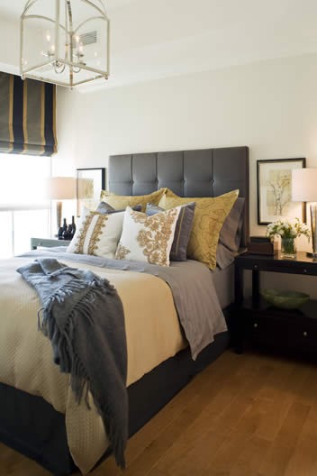
Here are some images I've been studying for inspiration for my bedroom redesign. 

I love the Mark Rothko-like art above the bed and the crisp, put-together bed.


I like the headboard and overall luxurious feel of this bedroom, plus the color scheme is right up my alley.


Love this bedding from West Elm.


Color scheme is perfy, of course. I love everything Dwell Studio.


Sorry for the crease in this one, it's a scan from the Domino decorating book. I like the simplicity in this room; just bright yellow and bright white is somehow satisfying.


This room is just calming. I like the striped pillowcases.


Another simple yellow and white room; love the navy and grey in the second one. The headboard is to die for as well.

A crooked scan ... sorry. I love the headboard replacement in the first photo - it's framed wallpaper. The second room is cheery. Love the sunburst mirror and yellow lamps.

More solid yellow and crisp linens. Ahhhh. 
Coming up ... the design board I created for my bedroom.

*Martha

Saturday, November 5, 2011

Master Bedroom Redesign on a Budget - Color Palette

...Or I could title this post: Getting Started on the "Someday." You see, our master bedroom is the number one room I keep saying I'll get to ... someday. Someday when we have money, more specifically. But guess what I realized? Someday when we have money coming in again, which is slated to be in approximately one year, that money is likely NOT going towards my dream home interior projects. It's going to savings, retirement and kids' college funds. Yes, as my hubby and I were discussing it recently, we will likely be living about the same no matter what our money situation is like in the next couple years. Which is totally smart! Repeat after me: smart, smart, smart. Wise, smart, level-headed, mature, adulty. (As in, "Look at us being all adulty." - Liz Lemon)

So, I decided to get going on my "master bedroom on a budget" and after a lot of thought and planning and looking, I think I'll be able to swing it! Is invention not the result of desperation? What? How does that saying go? 

Anyway, here's my color palette. Kind of funny how it's almost the exact color palette of our heading/logo. I can't deny that I have a thing for grey, white and black. And with navy and yellow thrown in, I think we'll have enough masculine/feminine, serious/happy colors to please both people who sleep in this room.


Stay tuned as I put the pieces together over the next little while.... 

Wednesday, October 19, 2011

Decorating around a TV

Decorating around a TV can be one of the trickiest parts of putting together a beautiful living room. Thank goodness we don't have to work with those ugly box TVs anymore! However, flat screens still present the same problem: just WHAT do I do with it?

I've collected some pictures that show some "outside of the box" thinking when it comes to incorporating a TV in a design-friendly way.

The surprising placement of this TV is that it's in front of windows. Ever considered that? I think it's an awesome idea.

The only time it would be tricky to watch TV in this setting is during the daytime. But who is home watching daytime television?? SAHMs, raise your hands! :) But, I could get over it. If I had this wall of windows, I could definitely get over a bit of TV glare. But let's be realistic. Your window wall would probably be better suited for drapes, so you could just pull the drapes during the daytime if Ellen at 4 is your afternoon cup of tea.
{Adore Home}

Bookcases are not just for books, of course. Or just for trinkets and books. Include your TV in your bookcase! Notice how the furniture looks like it can be adjusted according to what the room is being used for.
{Adore Home via Danielle Oakey Interiors}

People often think above the fireplace mantel is the obvious choice for rigging the TV. Think again! First of all, you don't want a crick in your neck from looking up at your TV. You always want the TV at eye level when you're sitting down. This photo shows a beautiful mantel display that makes a lovely focal point for the room, then the TV next to it is accompanied by a console table and accessories that help the TV not to scream "LOOK AT ME!".


I like the basket below that stores blankets for snuggling. Because what goes with TV watching? Blankets and snuggling!
{Little Green Notebook - incidentally the home of my former college roommate}

I love the idea of mounting the TV on the wall with a credenza below. Old school credenzas especially are my fave! I'm on the lookout for one for my own living room. Love, love, love.


In this dude apartment below, the caption really sums up what you need to know about decorating around a TV: "We know you love your TV. The trick is to display it in a way that doesn't sacrifice style. Try placing it on a sleek console (like this one from IKEA) and surrounding it with interesting objects. Be sure to keep the TV at eye level but let the accessories and the artwork be the focal point." 


{3 above: Lonny Magazine}

I like how the scale of this TV coordinates with the scale of the framed photos behind it. Plus, it's silver so it does a beautiful job of blending in to the black and white color scheme.
{Domino}

Back to credenzas - I've always loved this painted one in Jordan Ferney's home.

She changed it up later with some simple art above the mounted TV.
{Oh Happy Day}

Another painted credenza. This is Joanna Goddard's home (the blogger behind A Cup of Jo). Love that yellow.
{Little Green Notebook}


*Martha

Monday, October 17, 2011

Modern Fairytale Posters

Thank you Cup of Jo for posting these wonderful modern fairytale posters.


The artist is Christian Jackson and you can buy them here.

Monday, October 10, 2011

Glitter Art

I'm dying that Home By Novogratz is not on Hulu but I was able to catch a few episodes at my sister's house recently. Another thing I was dying over (in a good way)? The glitter art in one of their episodes. I kept hitting my sister in the arm and gasping, "Heather! Glitter art! Heather! Glitter art!" I don't know why I thought it was so genius ... I think it is the scale of the art. Each piece is quite H-U-G-E. It's done by Camomile Hixon and was featured in a home staging done by the Novogratz's, as seen below.


 {3 above images from here}


{2 images above from her gallery}

Are you as stunned by this large glitter art as me? Or are you like, "Puhlease. Glitter is so 2nd grade!"

*Martha
Related Posts Plugin for WordPress, Blogger...